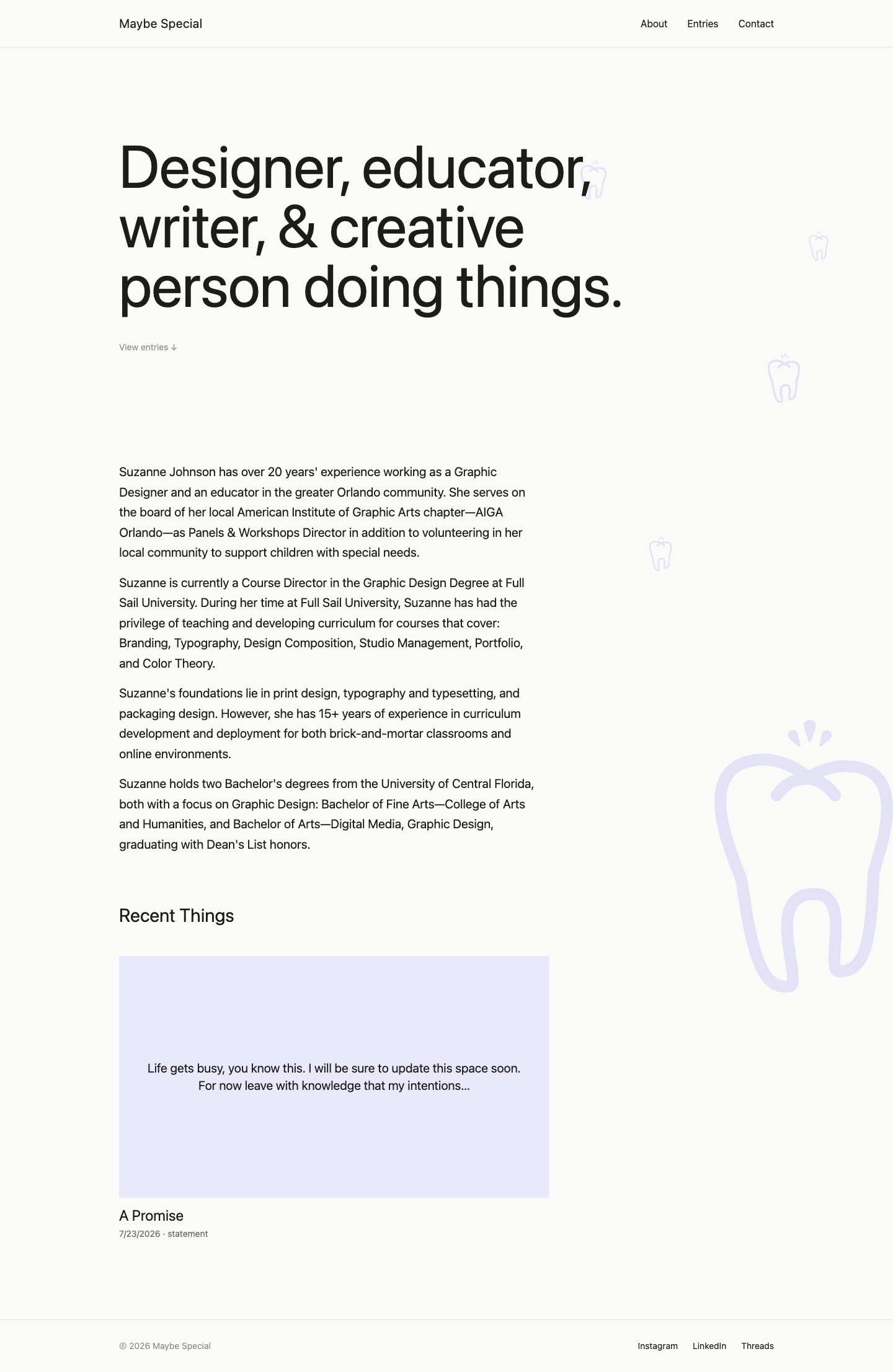
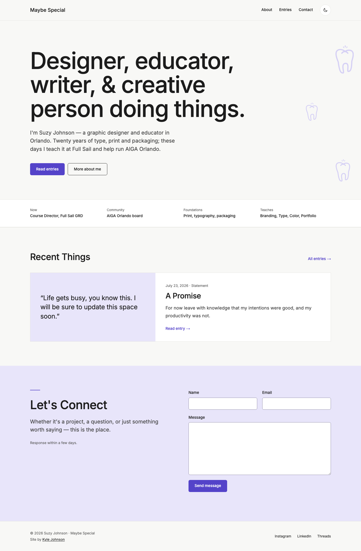
maybespecial.com
A refresh that made every page findable and accessible, while the owner kept editing her own content in Sanity.
- Role
- Designer and developer
- Stack
- React, Vite, Sanity, Tailwind CSS, Playwright, Lighthouse CI
- Timeline
- Jan 2026 – present
- Outcome
- 4 of 4 Pages that load from a direct link (1 of 4 before)
Proof · Lighthouse mobile · Tested Nov 2026
- Performance
- 100Pass
- Accessibility
- 100Pass
- Best practices
- 100Pass
- SEO
- 100Pass
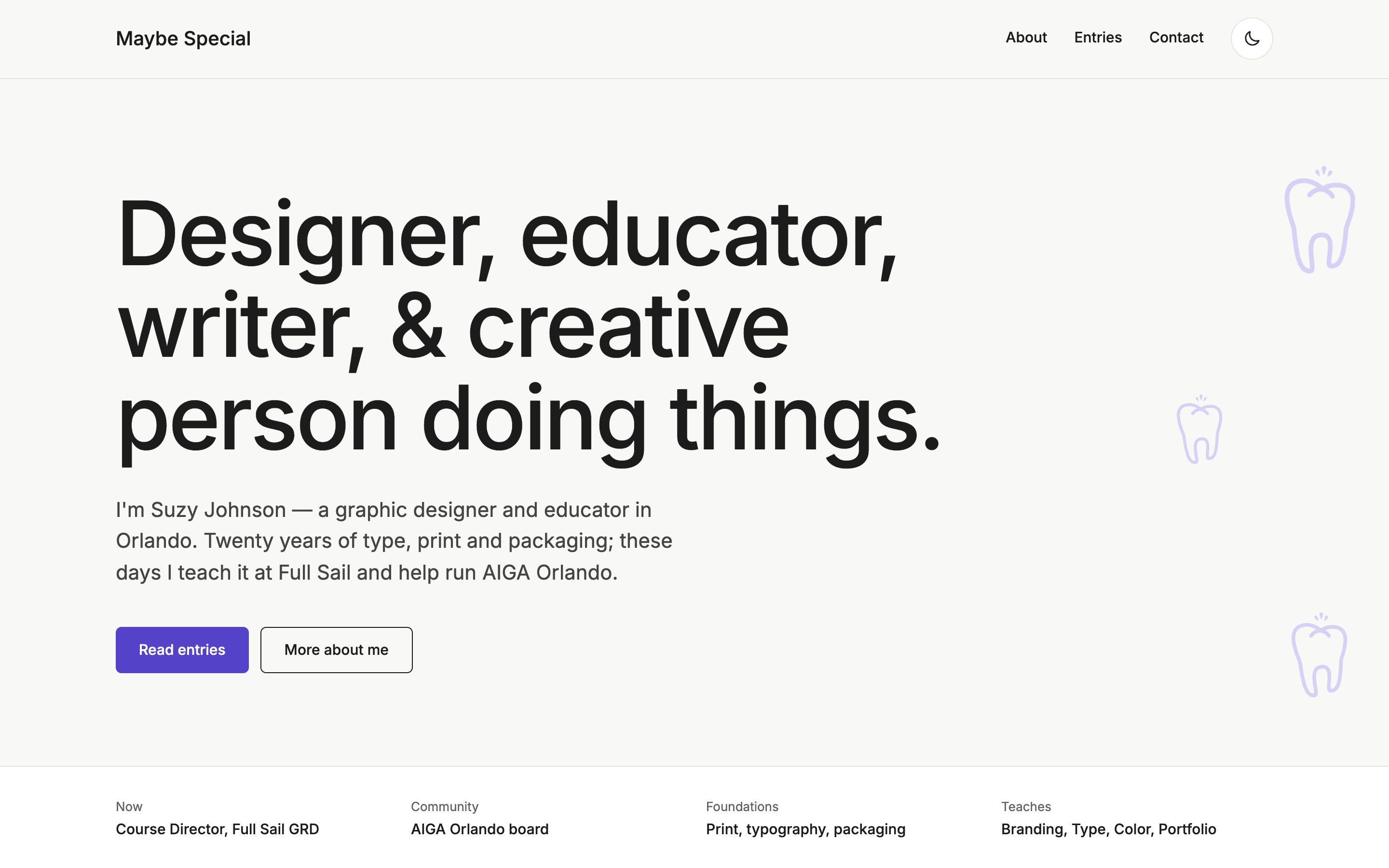
Problem
The site worked, and she could update it herself. But it had drifted from who she is: the bio read like a résumé in the third person, light lavender text failed contrast checks, and the home page had no meta description for search or link previews.
Nobody asked for a redesign. I just wanted it better for her, so I proposed a refresh, designed it, and she approved it.
A quality audit before any changes found more: every page except the home page returned a 404 when opened directly. Those findings went into a brand guide and a planning stage, where the decisions below were made.
Constraints
- She wanted it to work and stay easy to update, nothing more. The refresh had to add no work for her.
- Her editing in Sanity had to stay exactly as she knows it.
- Evolve the existing site, not replace it: same headline, same doodles, one typeface.
Key decisions
Let the client edit in Sanity, not in code
- Chose
- Fixed page templates with editable fields
- Instead of
- A drag-and-drop page builder
- Because
- She wanted to update her own work and words without worrying about breaking the design.
- Cost
- She can't rearrange page layouts herself; a new kind of section needs me.
Fix the contrast failure in the brand, not just the page
- Chose
- One violet accent and darker text tones, checked to pass WCAG AA in both themes
- Instead of
- Lavender text on the off-white page
- Because
- Lavender text was the old site's contrast failure. Fixing it in the brand's tokens means every page inherits the fix.
- Cost
- Lavender can't carry text anymore. It's a background tint only.
Prerender every page instead of shipping an empty app
- Chose
- Prerender every page to static HTML at build time, with its own title, description and share tags
- Instead of
- A client-only app, which GitHub Pages could only serve at the home page
- Because
- GitHub Pages serves files, so every other address returned a 404, and crawlers and link previews saw an empty page.
- Cost
- A new entry reaches the prerendered HTML on the next build, which runs daily. Visitors always see live content.
Outcome
Every page now loads from a direct link. Before, only the home page did: a shared link, a bookmark or a search engine got GitHub's 404 page for everything else.
Each page is now prerendered, so its content, title, description and share tags are in the HTML before JavaScript runs. A sitemap and robots.txt are generated on every build.
Lighthouse accessibility and SEO are 100 on every page, and axe finds no violations in light or dark, on phone or desktop, down from 17. The site also gained a dark theme that follows the system setting.
Every push runs lint, contrast, schema, browser and accessibility tests and a Lighthouse 95+ gate, and the site deploys only when they all pass. She still edits her own content in Sanity.
- 100 Lighthouse accessibility on every page (89–94 before)
- 100 Lighthouse SEO on every page (90–91 before)
- 0 Accessibility violations, light and dark, phone and desktop (17 before)